Google Search Trend and Stock Price Tracker
Contents
1. Google Search Trend and Stock Price Tracker#
The following Jupyter notebook supports use of the pyrends API for querying changes in Google search trends and the Polygon.io API for querying changes in a given public stock price. The notebook will generate a simple graph to show how these changes may corrolate over a selected time period. When running the notebook locally, be sure to add your Polygon.io API key to the stocks.py file (may be found in the src/ directory).
1.1. Step 1: Import Libraries#
Import pytrends, pandas, datetime, matplotlib and seaborn goodies, and homemade classes Stocks and Google.
from pytrends.request import TrendReq
import pandas as pd
import datetime as dt
from datetime import timedelta

from pytrends_support_hvk import google_trends
from stock_api_call.stocks import Stocks

import matplotlib.pyplot as plt
import matplotlib.dates as mdates
from pandas.plotting import register_matplotlib_converters
import seaborn as sns
register_matplotlib_converters()
1.2. Step 2: Set Variables#
Declare Google search terms, days for analysis (max = 250), and stock ticker.
kw_list = "vaccine"
days = 250
stock_ticker = "JNJ"
1.3. Step 3: Run APIs#
Query Google Trends and Closing Stock Prices with selected variables. Tweak results (add index to Google dataframe and change dates to datetime objects in Stocks dataframe).
google_trends = google_trends.Google (kw_list, days)
stock_trends = Stocks (stock_ticker, days)
gtf = google_trends.trends()
gtf = gtf.reset_index()
stf = stock_trends.stocks()
stf['Dates'] = pd.to_datetime(stf['Dates'])
1.4. Step 4: Merge results into one Trends table#
Save as .csv for playing around with
trends = pd.merge(left=gtf,
                    right=stf,
                    how='inner',
                    left_on='date',
                    right_on='Dates')
trends.to_csv("trends.csv", index = False)
trends
| date | vaccine | isPartial | Dates | Closing Price | |
|---|---|---|---|---|---|
| 0 | 2022-05-24 | 66 | False | 2022-05-24 | 181.40 |
| 1 | 2022-05-25 | 51 | False | 2022-05-25 | 179.62 |
| 2 | 2022-05-26 | 49 | False | 2022-05-26 | 179.46 |
| 3 | 2022-05-27 | 48 | False | 2022-05-27 | 181.09 |
| 4 | 2022-05-31 | 53 | False | 2022-05-31 | 179.53 |
| ... | ... | ... | ... | ... | ... |
| 164 | 2023-01-19 | 41 | False | 2023-01-19 | 169.53 |
| 165 | 2023-01-20 | 41 | False | 2023-01-20 | 168.74 |
| 166 | 2023-01-23 | 41 | False | 2023-01-23 | 168.31 |
| 167 | 2023-01-24 | 41 | False | 2023-01-24 | 168.31 |
| 168 | 2023-01-25 | 39 | False | 2023-01-25 | 169.51 |
169 rows × 5 columns
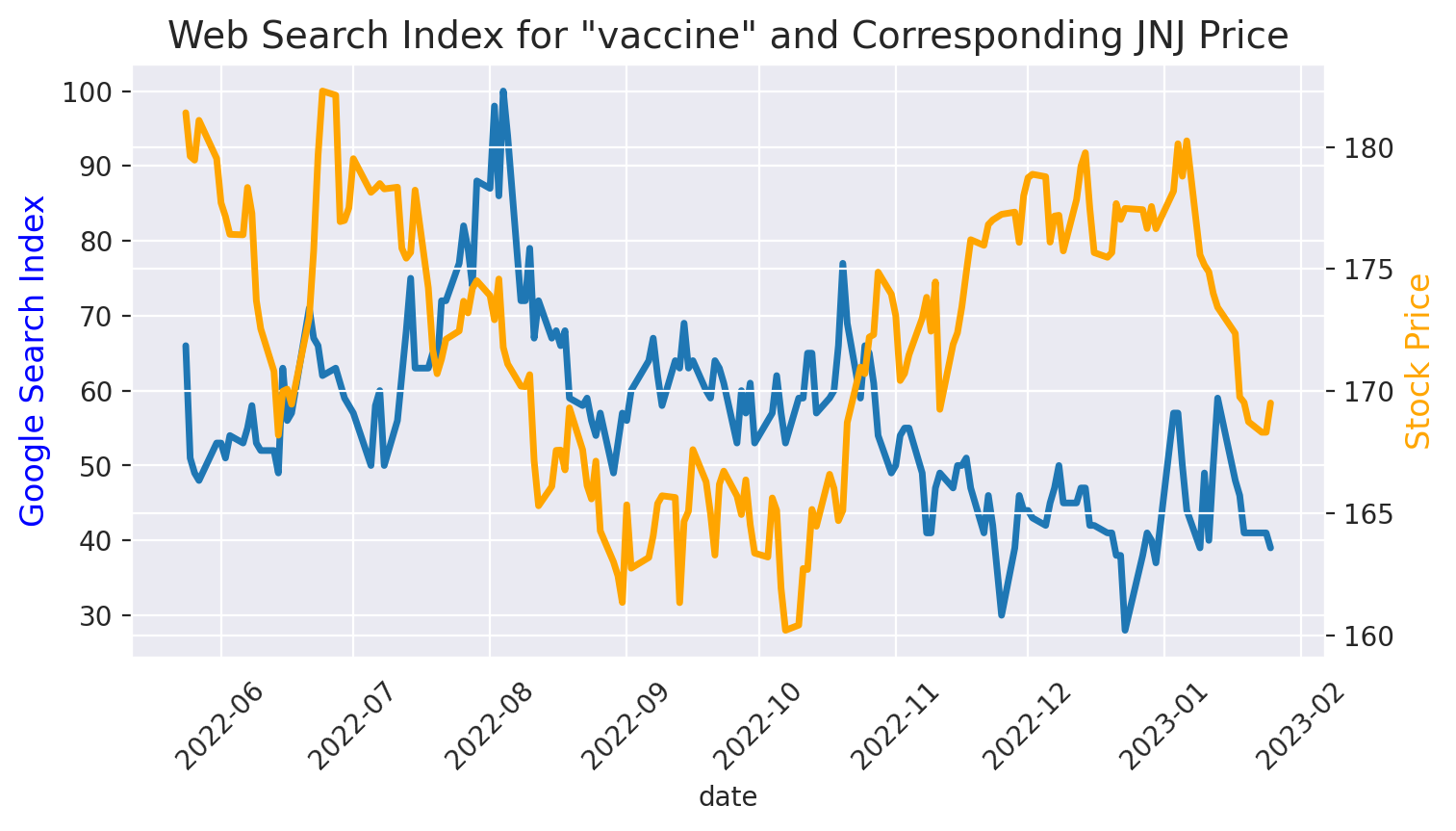
1.5. Step 5: Create a Pretty Graph#
Using Seaborn
with sns.axes_style('darkgrid'):
    plt.figure(figsize=(8,4), dpi=200)
    plt.xticks(fontsize=10, rotation = 45)
    plt.title(f'Web Search Index for "{kw_list}" and Corresponding {stock_ticker} Price', fontsize=14)

    ax1 = plt.gca()
    ax2 = plt.twinx()

    sns.lineplot(x= trends['date'], y=trends[kw_list], data=trends, palette="tab10", linewidth=2.5, ax=ax1)
    sns.lineplot(x = trends['date'], y = trends['Closing Price'], data=trends, color = "orange", linewidth=2.5, ax=ax2)

    ax1.set_ylabel('Google Search Index', fontsize=12, color='blue')
    ax2.set_ylabel('Stock Price', fontsize=12, color='orange')

plt.show()
/tmp/ipykernel_7020/779364875.py:9: UserWarning: Ignoring `palette` because no `hue` variable has been assigned.
  sns.lineplot(x= trends['date'], y=trends[kw_list], data=trends, palette="tab10", linewidth=2.5, ax=ax1)